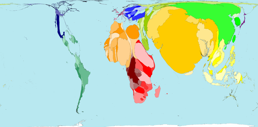
A few days ago, I received an email with this website (thx Isabel), with the tag line: “The world as you’ve never seen it before”:

This site has a huge database with maps, correlating several indicators, population density and countries dimensions. It reminded me a brilliant talk by Hans Roling on TED. It’s hard to understand the huge gap between the countries in many indicators. The question is: what can you do to change the situation?